If you are designing for the web and for mobile phones you might have asked yourself the following questions time after time… Common resolution for browser windows and content areas for web pages? Common resolutions on mobile devices? etc.
What is the most common resolution for web pages?
The most common desktop display resolution is 1366×768 pixel (30%) followed by 1920×1080 pixel (16%). Updated in May 2017, Source: StatCounter
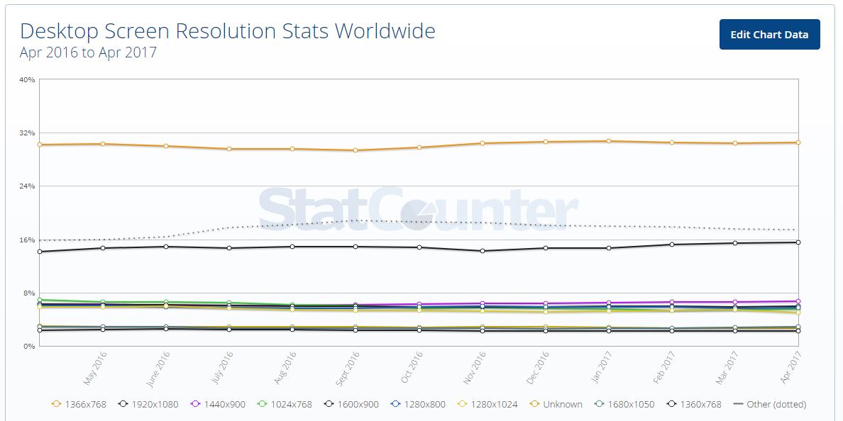
Most common desktop only screen resolutions (StatCounter)
If we look at desktop and mobile, 1366×768 px is only second to 360×640 which is the most common mobile screen resolution.
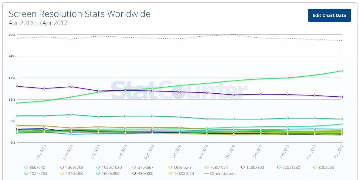
Most common desktop AND mobile screen resolutions (StatCounter)
Besides StatCounter additional sources of statistics can be the w3counter, rapidtables or w3schools
While the most common one is 1366×768 at the moment the resolution of 1920×1080 is quickly picking up usage since it is a common notebook widescreen resolution – a device type which is taking up more and more market share worldwide.
However, you should keep a few things in mind:
- The final screen real estate you have available depends on the users choice to use the browser in fullscreen mode or manually reducing the size of the browser window (especially on really large screens). Additionally lot of browser users have 3rd party toolbars, bookmarks, etc. which take space away from the actual viewport for your website or application.
- In different parts of the world there are different devices available and popular. If your target market is within a specific country – make sure you know the statistics for that particular area.
- This statistical data is ever changing since popular devices and screen sizes within the market are changing fast.
Ideally you can design a responsive or adaptive system which is capable of catering different screen sizes without loosing much of the desired usability.
What is the common pixel width of a website content area?
The most common width for a website content area is 980 pixels. This width fits within the most common screen resolutions and is adopted by popular web frameworks like bootstrap, foundation any many wordpress themens.
What is the most common resolution on mobile devices / screens?
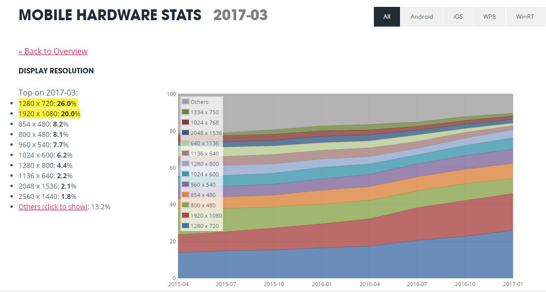
The most common resolution for mobile devices is 1280×720 (26.0%) and 1920×1080 (20.0%). Updated in May 2017 (see current stats on unity3d.com)
On material.io you can find a list of Android and iOS devices with their resolutions, aspec ratios and pixel densities – without any statistical information though. For Android you can find some statistics on Android platform and screen sizes as well as some info on what “normal”, “medium” and “large” means on Android.
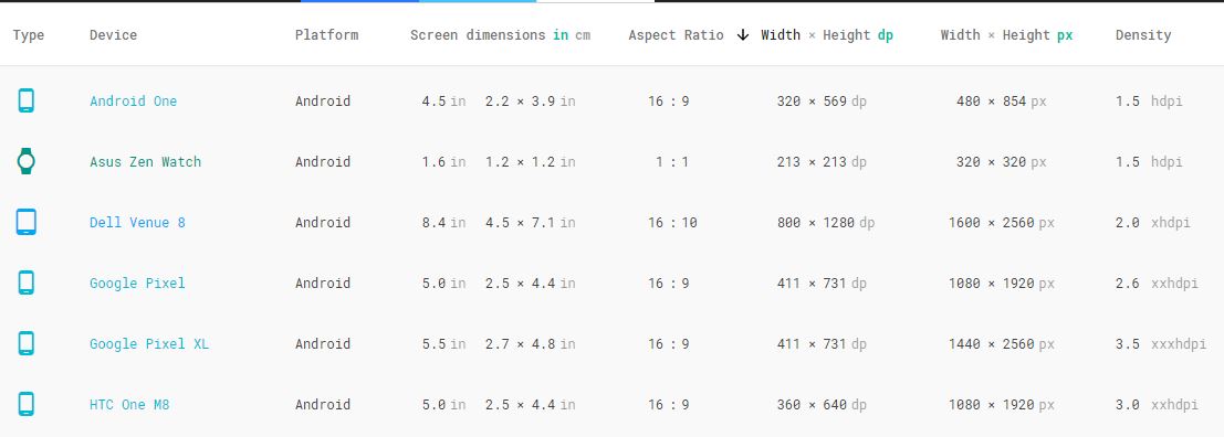
Device resolution table at material.io
In general, you should make your design responsive, independent on the screen size and pixel density of any device. Instead of designing your UI for a single resolution (and thereby for a single device type) you should design it to be resolution-independent.
To make sure your design will work on all common mobile devices you should take a look at the distribution of Android device screens and Apple device screen sizes. Depending on your target audience and the global device market share you can prioritize.
For native Android Apps you should provide the graphical assets in different sizes which will automatically used on the matching screen size and pixel density depending on the device.
Further reading and sources
- http://ux.stackexchange.com/questions/36337/what-is-the-generally-accepted-resolution-for-mobile-design
- http://ux.stackexchange.com/questions/41466/why-is-1366×768-considered-by-some-to-be-the-standard-widescreen-for-modern-lapt
- http://ux.stackexchange.com/questions/6929/common-screen-resolution
- http://ux.stackexchange.com/questions/28124/what-is-the-current-pixel-width-standard-for-a-websites-content-area
Do you have anything to add or a question about this topic? Feel free to send an email or leave a comment here.
.

Comments are closed.