
You might be confused by the different terms “fluid layout”, “responsive layout” and “adaptive design” which are heavily used in web and mobile development recently. Let’s try to explain and show the differences.
What is a fluid design layout?
A fluid design layout (or liquid design) is scaling the width of containers relative to the window or viewport width by using percentage values. It maintains the visual arrangement of the elements on all screens.
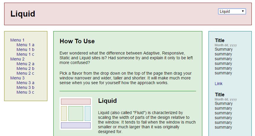
Example for Liquid Design Layout / Fluid Design Layout (Live Example)
Pro
- Since the elements are proportionally scaled they take up the same percentage of screen space on different screen sizes. The effect are a similar looking layouts troughout most screen resolutions.
Cons
- Container sizes are not defined. The result can look ugly if the window size is much smaller or much larger than intended. In smaller cases text elements might overlap containers or uncontrolled linebreaks might split up words into single characters. In cases with a larger screen there might be large areas of whitespace without content or text written out in a single line instead of a block.
What is a responsive design layout?
A responsive design layout manually defines different visualizations and layouts for different screen sizes using the CSS Media Query feature. As a result the designer and developer have to define dedicated viewport sizes with a corresponding container layout for each viewport. CSS Media Queries can also detect if the device can use touch features.
Within each container layout, the design is liquid and resizes the width of elements relative to the changing window size. Responsive layout is essentially a series of nested liquid / fluid layouts.
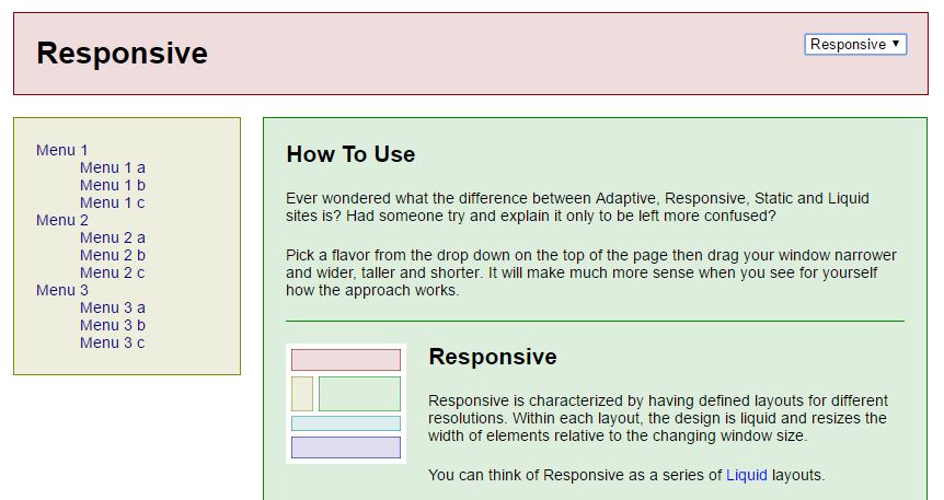
Example for Responsive Layout (Live Example)
Pro
- The interface can be tailored to specific screens, resolutions and devices like mobile phones or tablets. This can result in a better user experience for example by showing content in a single column on a mobile phone.
- Fonts sizes can be adapted to the resolution of the device to increase readability.
Cons
- There is an increased effort for the designers and developers to define and implement the different behaviours and layouts for each relevant viewport size. Depending on the modularity of your css code small changes could result in an array of follow up changes for other media queries.
- With new popular devices and resolutions hitting the market every few months it can be a hassle to test your application on all of them.
What is an adaptive design layout?
An adaptive design layout is a manually defined layout and arrangement of containers for different screens, devices and viewports by using CSS Media Queries. However, in contrast to the responsive layout, the containers of an adaptive layout contain static layouts within its containers. Therefore the inner layouts of a container do not change while the screen is resized and the outer layout is adapted to the new resolution.
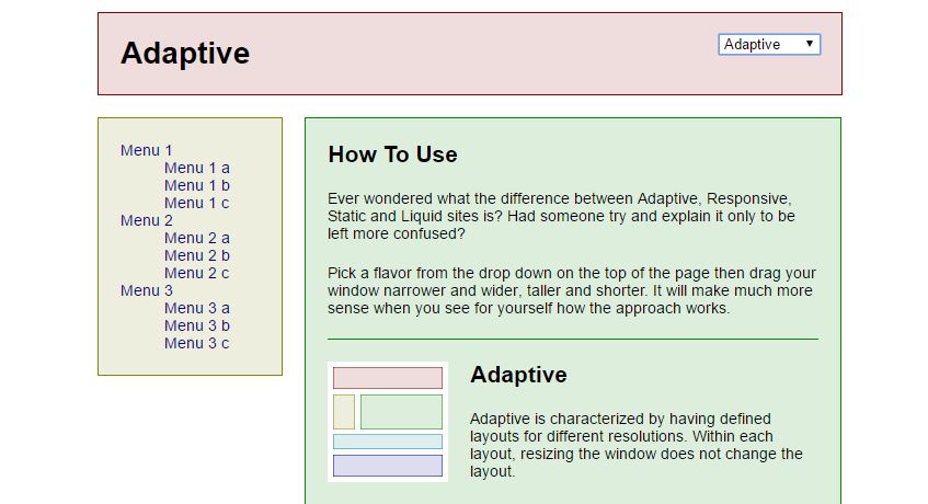
Example for Adaptive Layout (Live Example)
Pro:
- Increased usability by adapting the layout to different screen sizes.
- Inner container layouts remain stable in their visual appearance no matter the outer resolution. This way the designer can define and predict the users experience much better independent of the device.
Cons:
- Increased design and development effort for defining and implementing different layout behaviors for different screen sizes.
What is a static design layout?
A static design layout is an arrangement of containers with clearly defined dimensions in pixels. The dimensions and font sizes do not change no matter which screen, device or resolution is used.
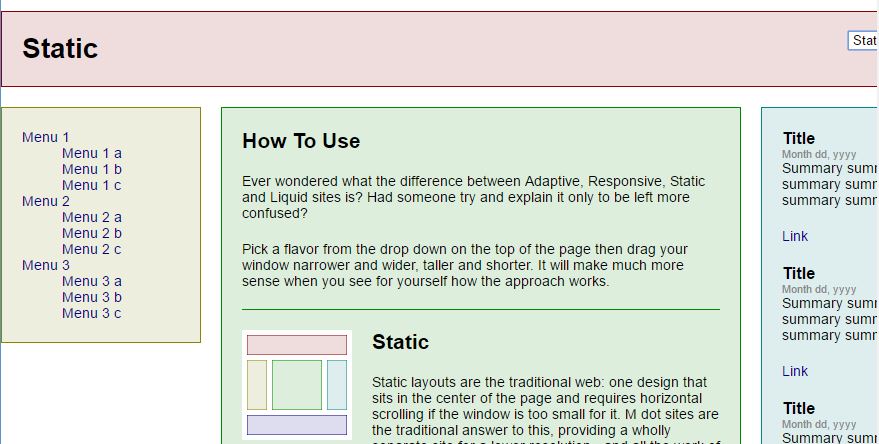
Example for Static Layout (Live Example)
Pro:
- The designer can clearly define pixel perfect arrangements and designs without having to think about different resolutions
Cons:
- Due to the wide range of devices and resolutions it is not state of the art anymore.
- There are lot of cases where the user can either not read the content at all or has to use zoom and panning extensively
- To cater a mobile user experience the provider has to design and implement a completely new page for a smaller resolution. Usually the mobile page is hosted on a different subdomain like mobile.mydomain.com
What are the main differences and do I need to choose just one?
Comparing all of the above makes sense, but there is almost no possibility to choose “the best one” in general.
Where it is easy to say the static layout is a thing of the 90′ we need to look closely at the benefits and drawbacks between responsive and adaptive to make a call. It depends on your application and your preferences as a designer. Here you can find a few gif videos explaining the difference to make up your mind.

Responsive on top, Adaptive on the bottom (Source: CSS Tricks)
The layout mechanics you choose should serve the following three things:
- the user experience you want to create
- the business goal of your application
- the expected usage in the wild (different types of devices and their statistical distribution – now and in the future)
Essentially: “A responsive design is a good strategy for future-proofing a site against the possibility of any (perhaps even unreleased) device on the market.”
Hey wait! What about “adaptive functionality” …
You might know those or similar discussions from your daily work:
- Does the user even need the feature xyz on a mobile phone?
- Should we even implement drag and drop for desktop?
- How can we solve context menus and tooltips on mobile devices?
- Should we implement a feature in two different ways, just to have native ux for mobile and desktop users?
With the power of responsiveness and adaptability of interfaces we also have the freedom to include or exclude features depending on the screen resolution or availability of device features. But the question remains: When should we make use of it?
In general, an adaptive system will change its appearance and functionality depending on the current use case of the user and depending on the real world context in which the system is currently used.
Let’s set aside the functionality of detecting the users intent and detecting the contextual environment and focus on the one thing we know and which matches the topic: Device type and Resolution
Both can give us information about
- Is it a mobile phone?
- Is it a tablet?
- Is it a touch interface?
- Do we have a mouse?
For multi-device-usage of your application it makes a lot of sense to think about removing features which are not needed on a mobile phone. Both in terms of available space for an additional button or link and in terms of usability by remembering the “fat thumb” phenomenon when building things like drag-and-drop features.
What is Progressive Enhancement and Graceful Degradation
There is one other thing called Progressive Enhancement (PE) which contains the main idea of starting at the very bottom of the pyramid. The content itself. Making that available to everybody and then working your way upwards to more functionality and style, depending on the client configuration and available browser features. Graceful Degradation was a predecessor to PE and is based on the idea of reducing features.
The core principles of Progressive Enhancement (PE) are:
- Basic content should be accessible to all web browsers
- Basic functionality should be accessible to all web browsers
- Sparse, semantic markup contains all content
- Enhanced layout is provided by externally linked CSS
- Enhanced behavior is provided by unobtrusive, externally linked JavaScript
- End-user web browser preferences are respected
Example:
- I have yet to find a useful and easy to understand example in the wild. If you know one, let me know!
As much as you like design – it’s all about the content and the user experience! And functionality is some kind of content too…
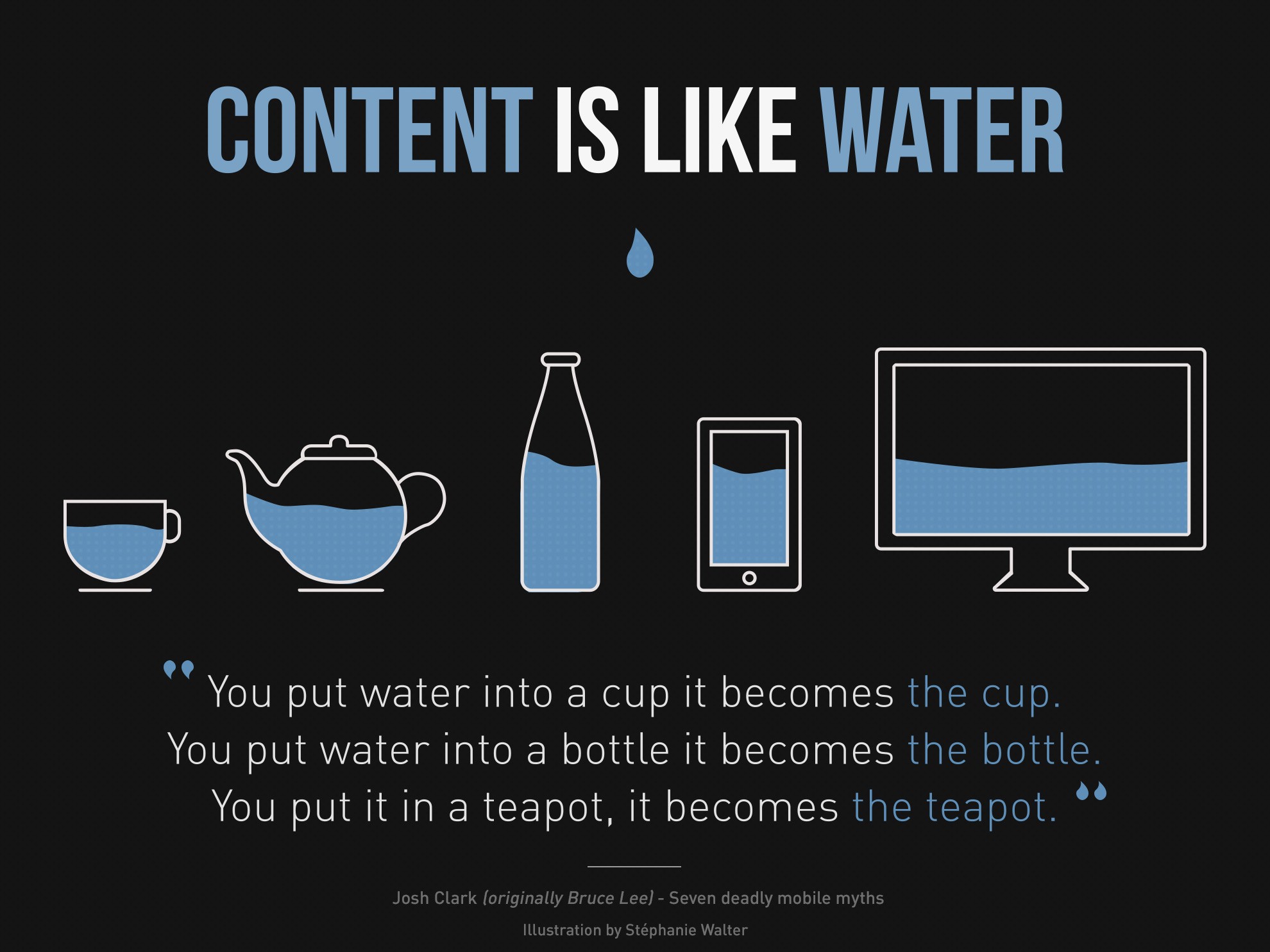
Copyright: Stéphanie Walter (c) CC BY-SA 3.0
Further reading and sources
- The similar question was answered by the UX.StackExchange community
- SmashingMag talking about “static and elastic layouts in 2009 and responsive design principles
- The folks at CSS-Tricks wrote an easy to understand article on the difference between responsive and adaptive
- The Interaction Design Foundation has a take on it too…
- SmashingMag on Adaptive Systems
Do you have anything to add or a question about this topic? Feel free to send an email or leave a comment here.
.
