Which color should a delete button have?
In a confirmation dialog the delete button should have the primary action color. Or if the design guidelines allow it, the delete buttons should be red or yellow to indicate warning. (See ISO 71010 for color codes)
If you are a designer or frontend developer you might know this discussion very well: “Why is the delete button on the right and not on the left?”, “Why is the cancel button red and the delete button green?”, etc. There are many flavors of this common controversial topic. Let’s try to clean this up…
Background context
In most software tools the user is asked to confirm a critical action like deleting something or changing an important setting. This is meant to prevent the user from doing something dangerous which can not be reverted. A good example is the deletion of a file.
One could imagine different visualizations for the confirmation dialog.


Now which one provides the best usability? The answer is: none of the above!
Both images above have critical flaws:
- They offer internally contradicting messages (a so called false-positive paradigm) by stating “Yes, delete” which contains a positive “Yes do something” but a negative outcome “delete” alongside with a negative “No, dont do something” but with a positive outcome “keep the file”.
- They use red and green which poses the risk of confusing your color blind users.
Suggested solution

- Simply make the “Delete” button more prominent. Make the “Cancel” button less prominent. I.e. by using a primary CTA color for the positve action and a secondary lighter color for the cancel-action.
- If the styleguide allows you can also use a color (on the primary action button!) which is emotionally attached to the action. Like red for deleting something or green for starting something.
- Use actionable labels so the user can predict the outcome without reading the headline. Like using “Delete” instead of “Yes”.
- You can further add clarity to the predicted outcome by using an icon on the primary button. However be consistent, watch out for primed expectations of your users and consider additional confusion as several studies showed.
- Always provide a way to “Cancel” the action so the user can safely re-evaluate his previous intention. The wording and visual styling for the”Cancel-Action” should be globally consistent troughout your application.
- Position the primary action (Delete) as the item which is read last (assuming LTR reading direction) so the user flow is improved. Why? Since the recently read options are remembered much better than the first read options. This can also be platform dependant. (You can find more details about the OK/Cancel or Cancel/OK discussion here at NNGroup)
In any case you should carefully consider how your users experience and interact with dialog information. However you decide, be consistent troughout your application and maybe even consider commonly used alternatives to a dialog box…
Alternative approach
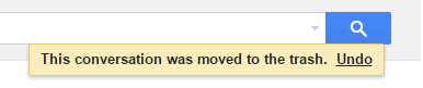
One alternative to “preventing mistakes” could just be to make the critical action revertable. Like undo. This is a good practice which is common with several Google / Microsoft products. The user is able to undo the delete action of an email for example.
Pro:
- The user can work much quicker and efficiently by just having one-click actions
- The system is much more user friendly since it allows for mistakes to happen
- The user has the opportunity to learn the system by just trying things without the fear of breaking something permanently
- You avoid pop up fatigue where the users are so used to clicking “yes” or “no” that they click any popup without even reading it properly
Con:
- From a technical point of view it can be quite challenging (and costly) to implement a feature like undo for all or almost all user actions
- You have to introduce an additional feature to the interface which might not be intuitive for all users and takes up space (i.e. with two additional buttons in the menu)
Further reading and source
- http://ux.stackexchange.com/questions/49991/should-yes-delete-it-be-red-or-green
- https://de.wikipedia.org/wiki/DIN_EN_ISO_7010
Do you have anything to add or a question about this topic? Feel free to send an email or leave a comment here.
.

Comments are closed.